Main takeaways
- Sign research puts readable lettering at about an inch of letter height for every 30 feet, in good conditions. That’s where our sizing starts.
- Out on a real road, that falls to about 20 feet per inch of letter height.
- For a sign set parallel to the road and read by drivers as they pass, the sign council’s table calls for letters around 8 inches on a car 20 feet back from a two-lane road.
We print a lot of windshield banners, and the first question on most of them is how big the year should be. The answer depends on who’s reading: someone walking the aisle a few cars away, or someone driving past on the road out front.
The sign industry has studied how far lettering reads for decades, almost all of it from the road.
The rule of thumb: an inch for every 30 feet
The United States Sign Council’s rule of thumb gives about one inch of capital-letter height for every 30 feet of reading distance. It replaced an older rule of an inch for every 50 feet, and it comes from test-track research with alert viewers who were looking for the sign.
Real conditions cost at least a third
Out on a real road, the same research finds readable distance drops by at least 35%, to about 20 feet per inch of letter height, and to as little as 7 feet per inch in complex settings.
Those numbers were measured on drivers, not on shoppers walking a lot, so we don’t apply them as if they were. What we take from them is simpler: a busy setting costs legibility, so the headline gets the space and the detail gets a smaller line.
For the road: the sign council’s table
A car parked along the road reads like a sign running parallel to traffic, readable only for a moment: in a USSC field study, drivers looking for parallel signs still missed 30% of them.
The council’s table for a sign parallel to a two-lane road:
| Distance from the curb | Letter height |
|---|---|
| 10 feet | 6 inches |
| 20 feet | 8 inches |
| 40 feet | 12 inches |
| 60 feet | 16 inches |
That’s a lot of letter for a windshield. It’s why a message meant for the road usually goes on the body side, where there’s room for it.
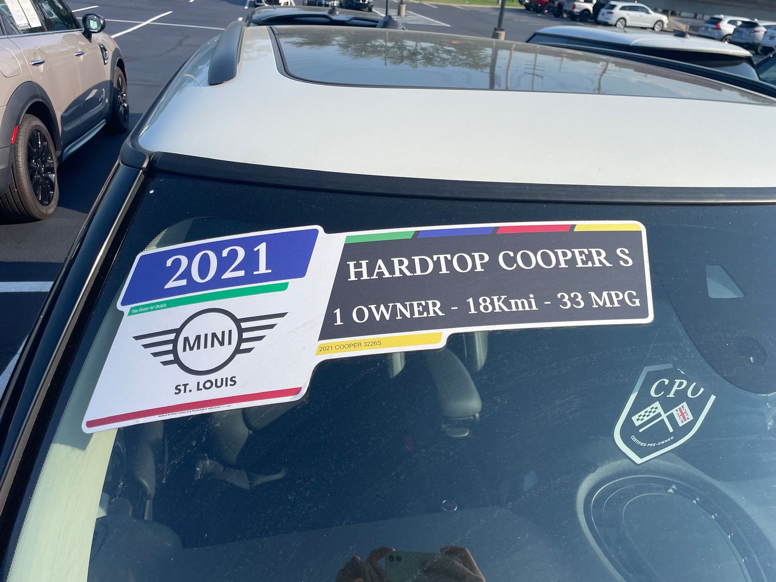
On the glass. Our used-car flyouts put the year first and biggest, the model beside it, and three facts in one line under it.
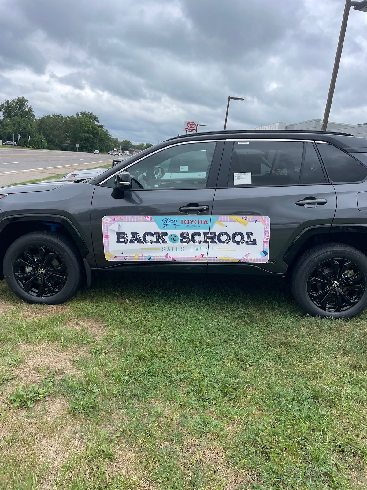
For the road. A standard body side prints at about 58 × 17 inches and runs level along the doors, printed vinyl on the paint.
Two more findings we print to
- All-caps lettering has to be about 15% taller to read as well, and most studies find mixed case more legible.
- Outlined lettering has to be almost twice the size to read as well as solid. We keep the key word solid.
What we don’t claim
Nothing here measures windshield graphics. Sign research is roadside and storefront signs, and the numbers come from alert viewers in good light or from drivers in traffic. Signs also read almost twice as far by day as by night, and we don’t promise night reading for unlit vinyl.
We use the research to set a starting size, and the proof shows it at that size before anything prints.
Sources
United States Sign Council, Sign Legibility Rules of Thumb (Bertucci, 2006): the inch-per-30-feet rule and the older inch-per-50-feet rule (pp. 5–7), all-caps height (p. 5), parallel signs and the field study (pp. 16–17), Table 3 (pp. 18–19).
Garvey & Crawford, On-Premise Sign Research Review, Sign Research Foundation: the inch-per-30-feet rule (p. 4) and readable distance in real traffic (p. 5).
Bullough, Illuminated Sign Conspicuity, Lighting Research Center (RPI) for the Sign Research Foundation: mixed case (p. 7), outlined letters (p. 18), day and night legibility (p. 25).
More Field Notes
-
Three or four words
Why our windshield headlines stop at four words, and where the rest of the detail goes.
-

Contrast beats color
Why the key word on our designs sits on the plainest, highest-contrast ground, and what a border is for.
-

What reads from the parking lot
Showroom glass is read from outside, across the lot. How we size and space a message for that distance.