
A dealership’s colors go on almost everything we print. The question is where they go. Three findings from sign research decide it for us, and none of them is about which color looks best.
Black on white reads farthest
On the United States Sign Council’s legibility chart for externally lit signs, black letters on white rate a legibility index of 29, against 26 for white on black or yellow on green. The chart measures signs, not windshields, and we use it as a starting point.
So the word that has to carry, the model or the event, sits on the plainest, highest-contrast ground in the design. The brand colors frame it.
A border helps a piece stand out
Highway standards require a border on almost every sign, and the research review we use finds it helps a sign stand out. On a windshield banner or a door graphic, a clean border separates the piece from the glass or the paint behind it.
Outlined letters need almost twice the size
Outlined lettering has to be almost twice the size to read as well as solid; a 1997 study the Lighting Research Center cites put the factor at about 1.8. We keep the key word solid and use outlines only as trim, never on the word that has to carry.
Where the colors go
The brand colors carry the panel, the stripe and the logo block. On a flyout, the dealership block on the left is where the store’s colors live, and the message flying out to the right gets the contrast.
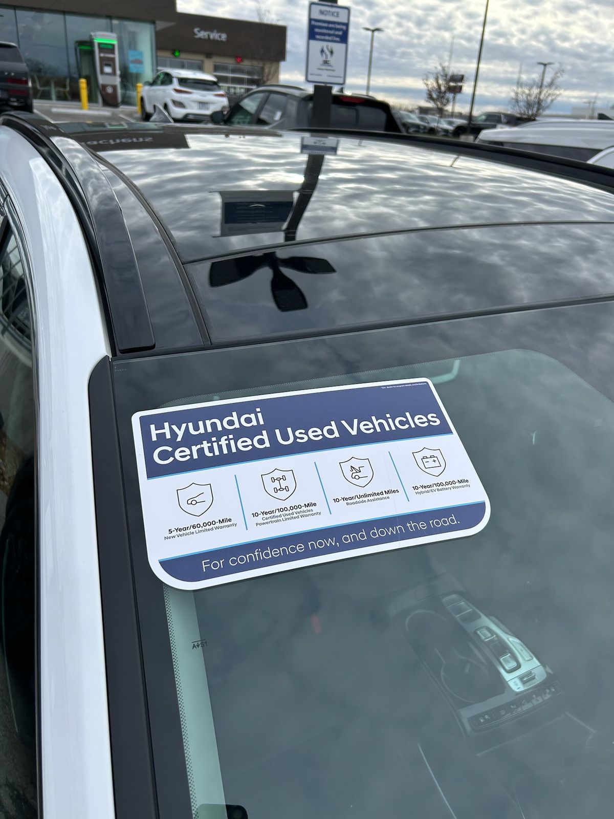
On the glass. Every windshield shape we print, with real jobs showing where the store’s colors go.
Sources
United States Sign Council, Sign Legibility Rules of Thumb (Bertucci, 2006): the legibility chart for externally lit signs (p. 6).
Bullough, Illuminated Sign Conspicuity, Lighting Research Center (RPI) for the Sign Research Foundation: borders (p. 5), outlined letters, citing a 1997 study (p. 18).
More Field Notes
-

The clocks fall back on November 1
Signs read almost twice as far by day as by night. What that changes in the fall and winter graphics we print.
-

Three or four words
Why our windshield headlines stop at four words, and where the rest of the detail goes.
-

What reads from the parking lot
Showroom glass is read from outside, across the lot. How we size and space a message for that distance.