Daylight saving time ends on Sunday, November 1. From then until March, a lot of the people who drive past a dealership after work do it in the dark, and they’re reading the same banners they read in October.
What the research measured
A 1998 study cited in the Lighting Research Center’s review for the Sign Research Foundation found sign legibility distances about 1.8 times longer by day than at night. That research is on roadside signs, not windshields, and it can’t say how far one banner will read on one lot. It does say which way the season pushes.
What we hold to harder after dark
- The headline gets the room. Three or four words, set as big as the piece allows.
- Contrast goes up. On the sign industry’s legibility chart, black on white reads farthest, so the key word sits on the plainest, highest-contrast ground in the design.
- No outlines on the key word. Outlined lettering has to be almost twice the size to read as well as solid.
- One message per piece. In low light, nothing on the glass should compete with the headline.
What we don’t promise
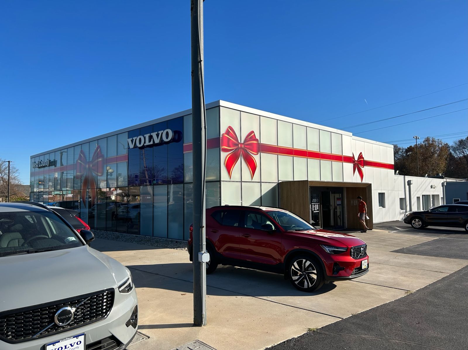
We don’t sell night performance for unlit vinyl. A printed banner reads by whatever light falls on it: the lot lights, the headlights, the glow from the showroom. We size and set the fall and winter pieces for the darker months; we don’t claim the graphic does the lighting’s job.
Planning the season. The Seasonal Lot Calendar has the November and December sets, each with a real piece.
Sources
Bullough, Illuminated Sign Conspicuity, Lighting Research Center (RPI) for the Sign Research Foundation: day and night legibility, citing a 1998 study (p. 25); outlined letters (p. 18).
United States Sign Council, Sign Legibility Rules of Thumb (Bertucci, 2006): the legibility chart (p. 6).
More Field Notes
-
Contrast beats color
Why the key word on our designs sits on the plainest, highest-contrast ground, and what a border is for.
-
What reads from the parking lot
Showroom glass is read from outside, across the lot. How we size and space a message for that distance.